
A membership website gives an audience one place to understand what is available, what joining means and how to return. That sounds simple until a creator offers monthly access alongside one-off purchases, private content and services. Each offer may make sense on its own, but visitors need to know which commitment they are making before they follow a checkout link.
Give monthly access a clear place on your membership website
Start by writing down what changes when someone becomes a member. The answer may be access to a continuing series, a private library or a recurring community activity. The membership page should say what is included, how often it is delivered and where someone goes after joining. If a benefit varies month to month, explain how updates will be announced.
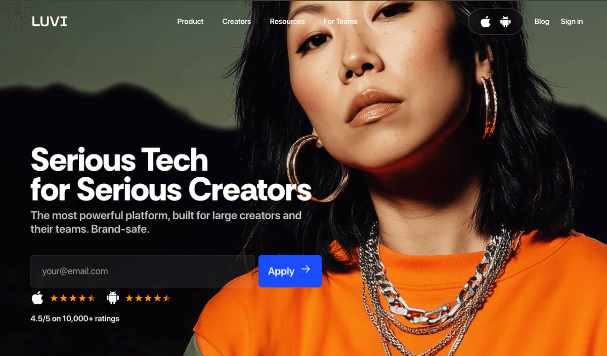
Luvi describes memberships separately from its public shop. A visitor reading the public feature list can distinguish a subscription from other ways to buy something. Apply the same principle to the navigation of your own membership website. A link labeled “Join the membership” should land on the recurring offer. A link labeled “Browse the shop” should lead to the items available for separate purchase.
Put the most important distinction close to the action. If monthly access includes a library but a specific service costs extra, say so beside the membership link. Avoid expecting visitors to infer the difference from product names or discover it only after they start a checkout.
Keep separate purchases easy to understand
Luvi lists a public shop, private media and payment links as separate features. These give creators different ways to offer a product or arrange a payment. The public information also describes payment links as an option when delivery happens elsewhere. For visitors, those paths can mean different destinations after they pay.
Make a simple list of your offers before designing the site. For each one, record the purchase type, delivery location and next action. A monthly newsletter might be a recurring membership delivered by email. A recorded workshop might be a one-off purchase with access through a library. An individual session might require a follow-up booking step. These are planning examples. Use terms that accurately describe the offer you actually run.
A membership website is easier to maintain when each offer has one canonical explanation. If you promote a workshop from several pages, link back to a single page that contains the current terms. If an offer changes, update that page and check the links that lead to it. This reduces situations in which a campaign page promises something the current offer no longer includes.
Plan the return path for existing members
A new visitor needs to understand the benefits. An existing member often needs a direct route to sign in, find the latest material or ask a question about access. Plan for both visitors in the navigation. The homepage can introduce the creator and the offer, while a stable member link lets returning visitors bypass the sales copy.

Luvi's public homepage provides a sign-in entry point alongside its product information. A creator building an independent membership website can take a similar approach. Keep an existing-member link visible on mobile and give it a label that describes the destination. If members sign in on a different platform, explain the transition and identify which account they should use.
Test the return route with the people who will use it. Ask one person who has never joined to find the membership details. Ask a second person with access to find the latest update starting from the homepage. Ask both where they would go if the link did not work. The answers will show whether the site needs better labels or a more visible support path.
Explain which platform handles the next step
A creator's branded domain can serve as the public home for the audience while another service handles payments or member access. The domain, the public site and the transaction service each have a different role. When visitors move from one to another, use consistent offer names and identify the destination before asking them to continue.
Luvi.fans is the domain used for Luvi's public information. Its homepage describes the platform's memberships and payment tools. That gives creators a concrete example of a .fans address used for a membership-related business. It does not establish how a different creator's site will take payments or manage access. Decide who handles those tasks before writing your signup instructions.
Check what appears in a mobile browser when someone follows your signup link. Confirm that the destination still identifies the offer, that the reader can return to your public site and that the help link reaches the right support channel. If the visitor leaves your domain, a short explanation before the link can prevent confusion about where they are going.
Write the site around the decisions visitors make
A useful homepage answers a few practical questions. Who is this for? What is available without joining? What does a membership add? Where does an existing member sign in? Other details can live on supporting pages when they need more room.
Before launch, read the homepage and membership page together. Check that the descriptions agree and that any recurring offer is clearly identified before checkout. Review older posts and social profile links for outdated campaign pages. Then repeat the check on a phone. The main action should be clear without asking a reader to zoom or hunt through a long list of buttons.
Luvi.fans illustrates the value of naming different audience actions separately. A creator can apply that lesson on a smaller site with a membership page, a clear route for individual offers and a stable link for returning members. Build the site around how your audience will use it, then choose a name that is easy to share. If you are considering a fan-focused domain for your membership website, visit .fans to find a registrar.